Blog

Judging a Book by it’s Cover
When I first started working on The Governor’s Daughter, I had a very clear idea of the story I wanted to tell: a sweeping, political love story about revolution, legacy, and the impossible choices that come with both. But when it came to the cover… well, that journey was anything but straightforward.
The Evolution of a Cover: Finding the Face of The Governor’s Daughter
When I first started working on The Governor’s Daughter, I had a very clear idea of the story I wanted to tell: a sweeping, political love story about revolution, legacy, and the impossible choices that come with both. But when it came to the cover… well, that journey was anything but straightforward.
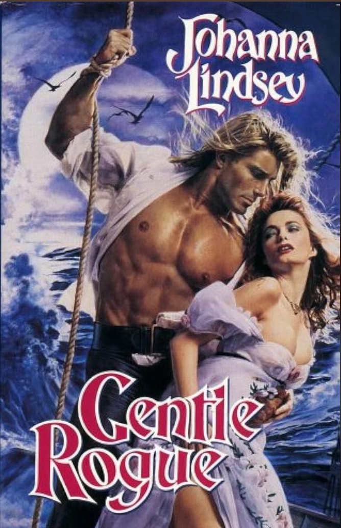
Like many romance authors, I grew up mesmerized by the classic clinch covers—those bold, dramatic illustrations where the hero's shirt was always torn open, and the heroine's hair whipped in the wind like it had a mind of its own. Johanna Lindsey’s Gentle Rogue was a huge inspiration—both as a love story and as a visual. I wanted to nod to that legacy. So, my first placeholder cover was very much in that vein: dramatic pose, intense embrace, and a vibe that said brace yourself, this is going to get steamy and political.

But placeholders are not final art.

When it came time to actually design the real cover, I tried going modern—shooting with live models. The result? It looked polished. Sexy, even. But it didn't feel true. It lacked the emotional nuance I wanted readers to sense before they even opened the book.
Next, I stumbled across a more symbolic photo—a woman in a red dress, set against a classy trellised backdrop. Thematically, it hit close to home. One of the key scenes from the book was reflected in it. I almost ran with it. But something kept nagging at me: it felt a little too stylized. Too posed. Too cold.
I kept searching. And searching.

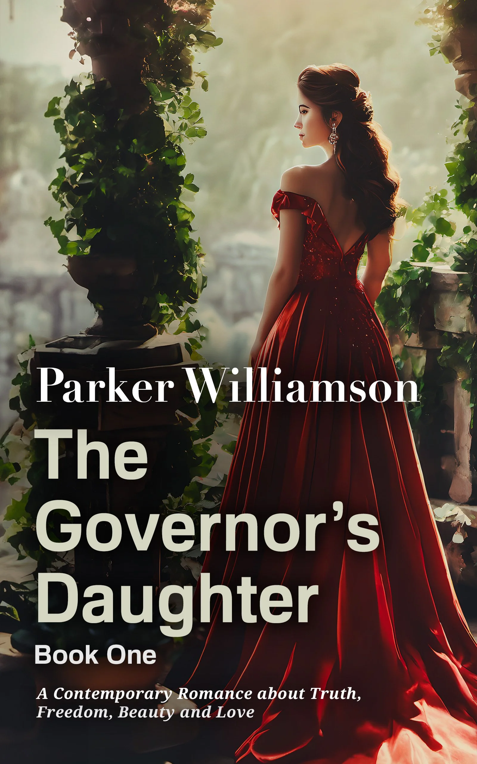
Until I found the one. The current cover—the final version—didn’t just illustrate the book, it embodied its soul. A woman in a red gown, walking away, her face unseen, yet her presence unmistakable. It felt quiet and bold at the same time. Romantic without cliché. You don’t need to see her expression to feel her resolve. The scarlet fabric billows around her like a flag of defiance, and the golden forest blurs behind her like the past she’s leaving behind. There’s beauty, yes—but also solitude, determination, and something deeply earned. That image told the story not of a love affair, but of a woman on the edge of transformation. And for me, that was everything.
But once I found the right image, the next challenge was just as critical: how much information actually belongs on the cover?
I played with genre tags at first—Upmarket Romance, Book One of the Han’gua Chronicles—but the feedback was clear: remove anything that doesn’t earn its place. So I did. I started stripping it back.
Then there was the subtitle:
“A Steamy Enemy-to-Lovers Romance.”
It wasn’t really part of the title, but it was important for SEO and online discoverability. The solution? I blended it into the clouds. It’s still there—Google sees it, Amazon reads it—but it doesn’t distract from the visual poetry of the scene. Compliant, but invisible.
That move freed up space to place the hook line—
“The greatest love stories are written in scars.”
—lower on the cover, where it could breathe. No longer fighting for space, it now floats there with intention. Quiet. Confident. Elegant.
And voilà.

Suddenly, the entire design transformed into something more minimalist, more purposeful. It no longer tried to explain itself—it invited the reader in. I trusted the visual tone of the art, the font of the title, and the emotional weight of the hook line to convey everything a reader needs to know.
Because sometimes, less is more.
Sometimes, the most powerful thing your cover can say is, trust me—there’s something inside worth opening.
What I Learned About Covers (the Hard Way)
Covers are not just pretty packaging. They are your book’s handshake to the world. Before readers read your blurb—or your first line—they see your cover. In a split second, they decide if you're worth a click.
It’s easy, especially as a writer, to choose what you like. The aesthetic you gravitate toward. The art that feels most "literary" or "romantic" or "serious." But here’s the brutal truth: what you like doesn’t always sell.
If you’re lucky, you’ll find a cover that does both. But if you have to choose between a cover you love and a cover that readers can’t stop clicking on—choose the one that works. Period. Your book’s job is to seduce readers, not flatter your personal taste.
I hope the final cover of The Governor’s Daughter does its job: stops readers mid-scroll, piques their curiosity, and pulls them into a story of love, power, and impossible choices. It took a few wrong turns to get here—but sometimes, that’s the only way to find what’s right.
About the Author
Parker Williamson writes about freedom, beauty, truth and love. A traveler of the world, he has been called a friend to paupers and princes alike. Parker passions include theatre, athletics, film, video games and of course writing.